|
|


|
FT FRONT PAGE - BUDGET 2014
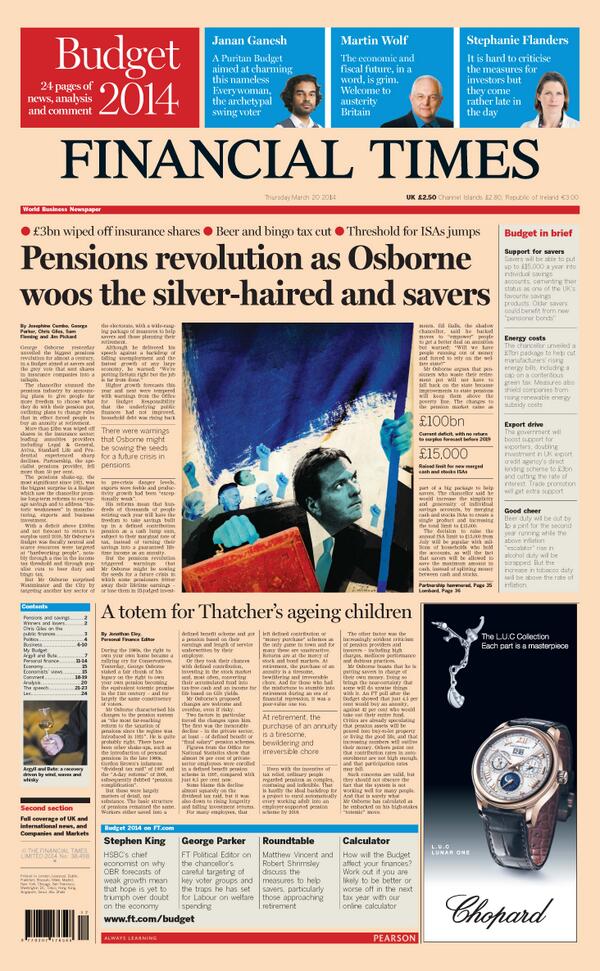
A very panicked, last minute illustration for the front page of the budget 2014 analysis issue. It popped up with Jeremy Paxman on Newsnight, and featured in that evening's newspaper review on BBC.

-----------------------------------------------------------------
-----------------------------------------------------------------
|
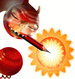
Secret amnesties for suspected terrorists...
A satisfying solution to one of the Friday afternoon illustrations for the FT.
The article was on the story which came to light about the government giving secret 'amnesties' to 180 or so suspected terrorists, effectively exempting them from ever facing prosecution for murders committed during the years known as the 'troubles' in Northern Ireland.
I thought about the families of the victims seeking to know who was responsible for the deaths of their loved ones and thought that a way to convey this 'unmasking' of the perpretrators would be to show a balaclava - that instantly recognisable symbol of terrorism - being unravelled to reveal the face hidden beneath it. The 'terrorist' is shown calmly and defiantly snipping the thread, thus stopping the unmasking process and remaining anonymous - and evading justice.
I positioned the arms very deliberately to suggest that where they had once held a rifle, they now held something else - a new 'weapon' against their perceived enemy now that the conflict is over (the 'Get out of jail free' card from the game 'Monopoly', which the author mentioned directly in his piece).
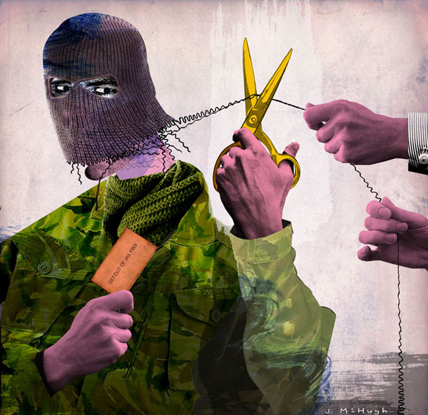
With this concept in mind it was just a matter of making the composition work in the best way to convey this idea. The lines running behind the structure of the composition all effectively converge on the point where the scissors meet the thread, drawing the eye towards this point. As always I only had a few short hours to come up with something.
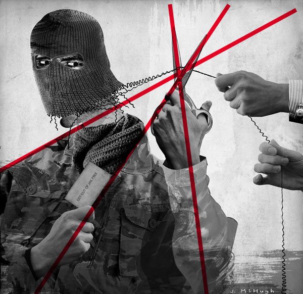
Although the story in the news concerned Irish terrorists, the author alluded to former Yugoslavia and other parts of the world where there had been sectarian conflict, and where such amnesties had been granted as part of a peace 'process' in the past and noted the damaging effect of such amnesties on the families of victims, and on the idea of 'justice' itself.
-----------------------------------------------------------------
-----------------------------------------------------------------
|
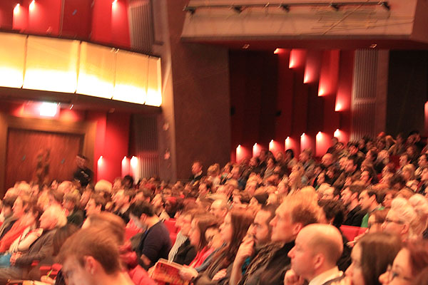
MAIN STAGE SPEAKER, OFFSET2013, DUBLIN...!
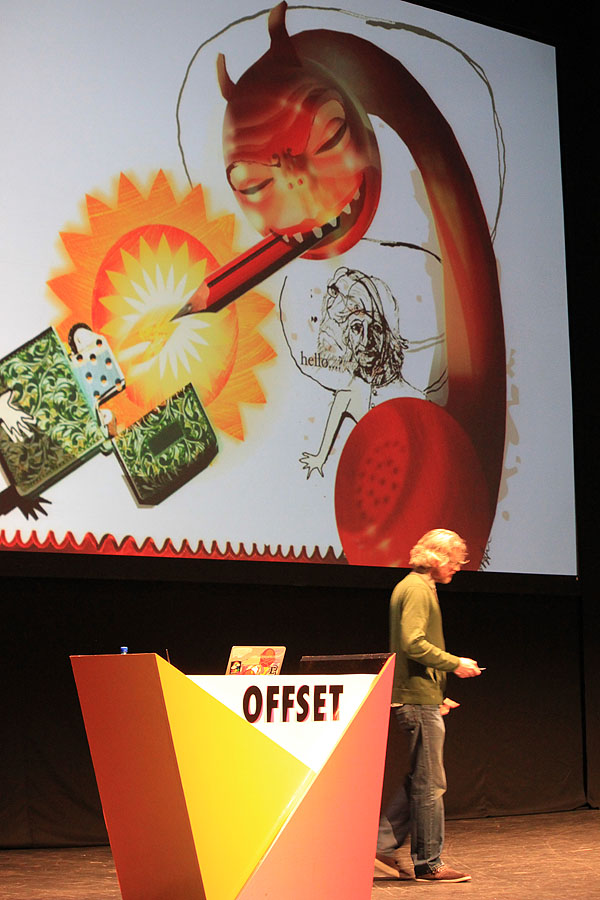
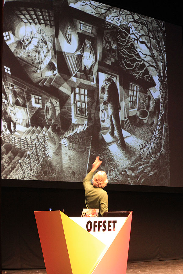
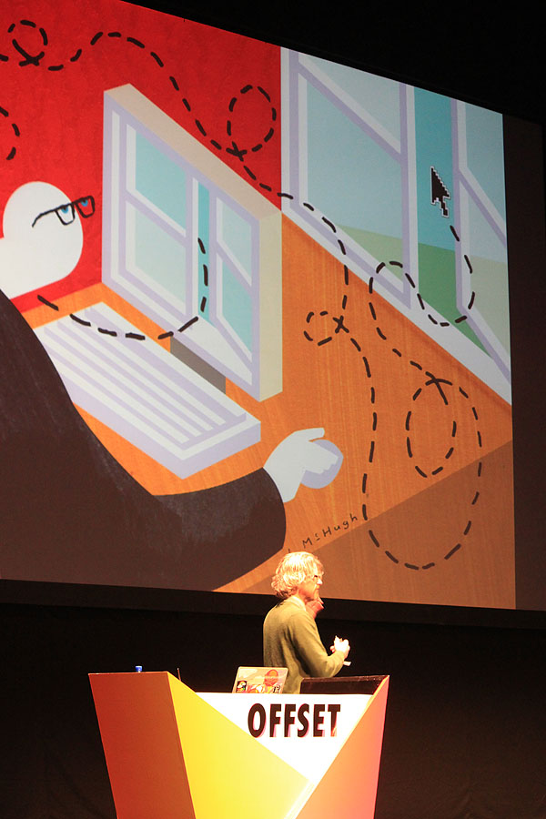
I was hugely flattered to be asked to give a presentation of my work at the prestigious OFFSET design festival in Dublin recently. OFFSET has been a yearly event since 2009, and has quickly established itself as a premiere event in the design calendar due to the heavyweight names it has had gracing it's stage over the past 4 years. Of course, I felt a bit out of context in such esteemed company, but I was pleasantly surprised by the enthusiatic response I got from so many delegates to my talk. A lot of people seemed to get something out of it, and everyone was super friendly. It was my first time attending OFFSET in any capacity, so I was as awestruck as everyone else at how inspiring the whole event was.
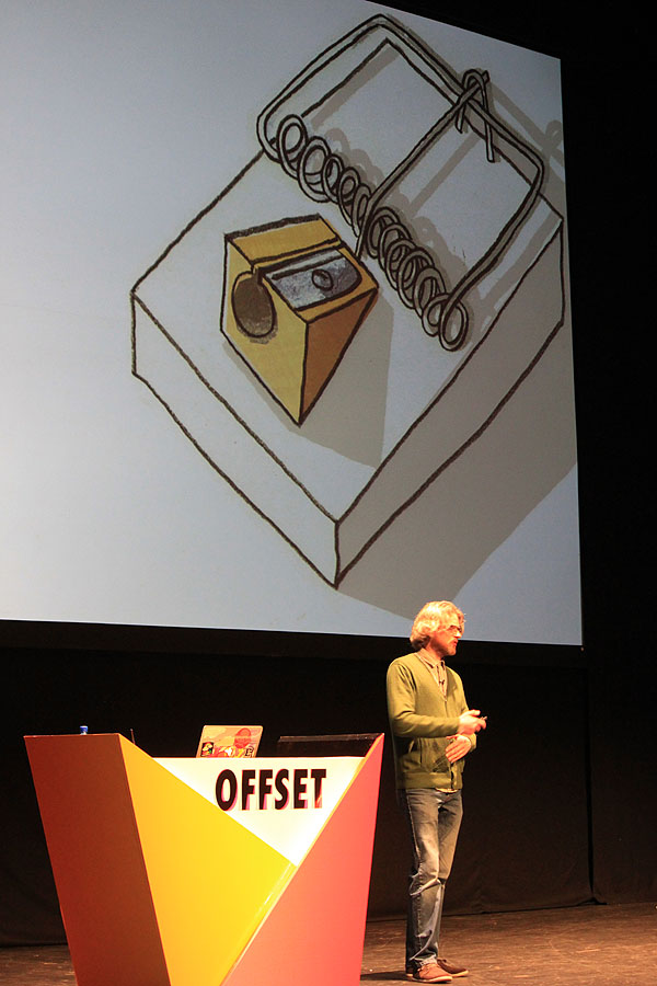
My own personal highlight was having Dutch design legend Ben Bos (who was intimidatingly sitting in the front row after his own talk) warmly shake my hand the next day and compliment me on my 'vonderful verk'...
Huge thanks to Bren, Richard and Peter for organising the whole thing and for inviting me along.
Click the OFFSET link on the side of this page for more information...
Thanks to Pamela Bowman for the pics
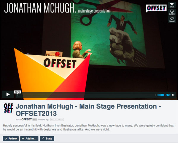
UPDATE: Video of my full talk now available to view on the OFFSET archive...
-----------------------------------------------------------------
-----------------------------------------------------------------
|
Punjana Tea...
Recently I had the opportunity to work on a series of illustrations to be used to advertise the much-loved and well established local tea brand 'Punjana' - manufactured by Thompson's Family Teas. The brief was to do several pieces of artwork which would show the historical span of the brand - so an image of a late 1800's tea clipper in the port of Belfast, a 1930's tea dance, a 1960's scenario and also a more contemporary scene. As well as being used as billboards etc., they would also be animated together to make a 30-second TV ad....
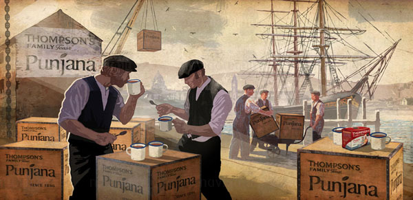
The images had to be at a high enough resolution to work on 48-sheet billboards, and also needed to have enough going on to allow them to be animated. This meant that every element within the piece had to be able to be moved independently - so although a static 2-D composition, it had to have flexibility factored in to allow for a basic 3-D animated treatment of the flat layers that made up the piece.
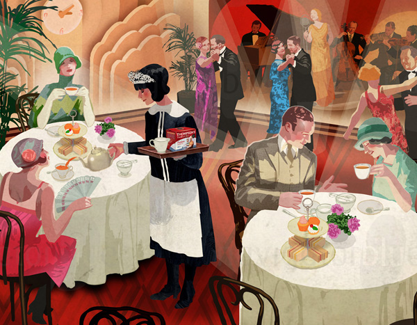
The period details were fun to research and helped create a mood for each piece. Each piece was like setting up a little shot in a movie and was one of those times when being an illustrator requires you to wear many hats - in effect, you need to be part-lighting director, part-costume designer, part-casting, part-cinematographer, part-props department etc...! All the decisions about the 'look' are down to the illustrator, with the art director making suggestions and outlining what the overall 'feel' should be and what the image should communicate.
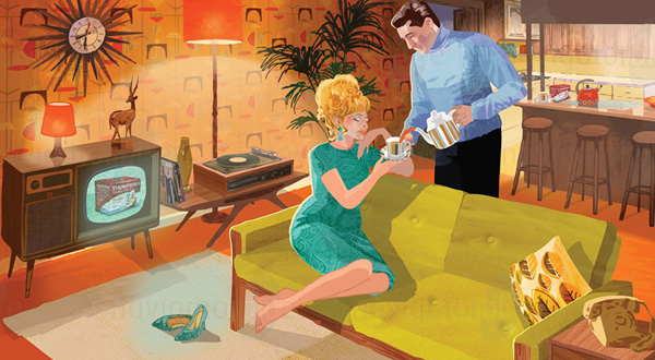
It was also nice to work with Terry Corr at Navigator Blue again, who commissioned and art directed the campaign.
The campaign also won two PANI Awards: Silver for best multimedia campaign, and a Gold for best television advert between £25k-£75k.
-----------------------------------------------------------------
-----------------------------------------------------------------
|
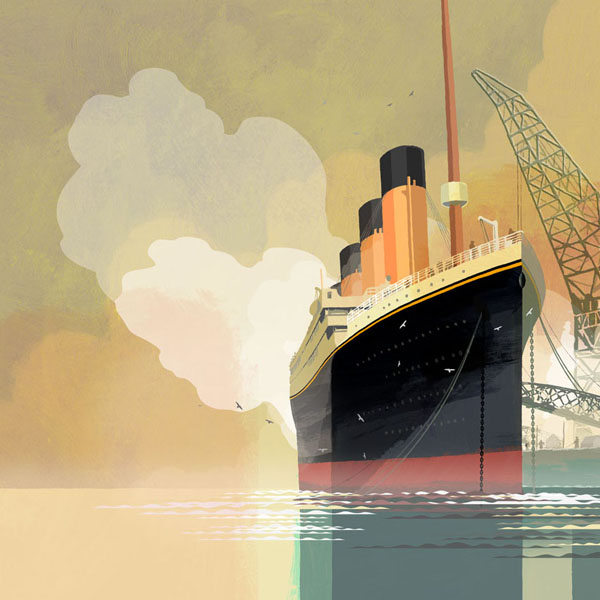
TITANIC BELFAST SIGNATURE PROJECT...
A commission to produce several large scale site specific murals for display in the Titanic Belfast building & exhibition...
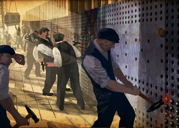
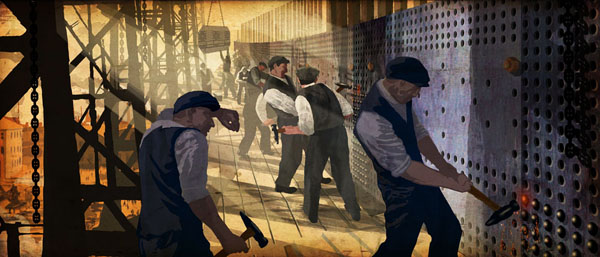
7.2m wide 'Riveters' mural
-----------------------------------------------------------------
-----------------------------------------------------------------
|
A last minute, three-word brief...
Friday morning, 11.40am. Having a coffee and a danish in my house and comtemplating priorities for the day ahead. Phone rings. Chris from the Financial Times in London on the other end tells me that there's an article today after all, and it's by the Chancellor of the Exchequer George Osborne. The Chancellor won't be filing copy until late in the afternoon, and the whole of Europe is waiting to see what he'll say. Therefore, in the absence of anything more concrete to go on, the illustration is to be a fairly generic one on the subject of the series of articles appearing under the heading of 'Capitalism in Crisis'. Do your best with it. Go...
Yikes...
Forty minutes later I email off a rough idea and have my lunch while I await a response. The idea being to show 'capitalism' in the form of the two symbols of the financial markets - the Bull and the Bear. The Bull represents financial arrogance, the Bear represents the Markets in retreat. I thought if I depicted them in the same perilous predicament together, rather than fighting with each other, it would make for a strong visual. The idea is approved at about 1pm, and I then spend the rest of the afternoon working on final artwork and email final image to client at 4.55pm. Client happy. Job done.
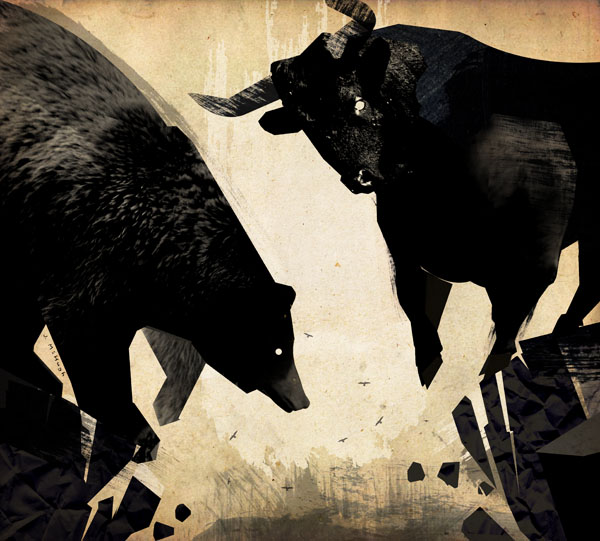
A few hours later the image and article are 'live' on the FT website and I finally get a chance to read text of the article. Thankfully, as early as the second sentence the Chancellor has made mention of 'collapsing financial markets'...
Bullseye...!
-----------------------------------------------------------------
-----------------------------------------------------------------
|
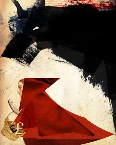
European Newspaper Award...
Very surprised to find that my 'Red Riding Hood/Big Bad Wolf' illustration for the Financial Times picked up an award for excellence at the prestigious European Newspaper Awards this week.
It warranted a mention on the front page of the Financial Times. I even got a namecheck. Looking through the list, it was the only award for a GB newspaper in the illustration category.
Not everyday you get a mention on the front page of a national broadsheet newspaper...! Chuffed!
-----------------------------------------------------------------
-----------------------------------------------------------------
|
|
FINANCIAL TIMES - 24.09.11
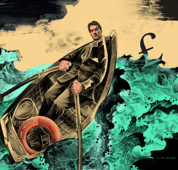
'George Osborne needs to be bold to save the economy and his career'
This is a little piece I enjoyed doing. The illustration accompanied an article by Richard Lambert in the 25th September issue of the FT.
When I began to think about how to approach it, I decided that I wanted it to have a bit of drama, to show him in a vaguely heroic 'boys own' type scenario befitting of his public school background - something old fashioned - and with colours that I hoped would convey a toxic sea and acidic sky, adding to the drama of his predicament.
The scene itself could be interpreted several ways - he could be in a lifeboat fleeing a sinking ship, he could be cast adrift alone on a sea of troubles, but the main thing I hoped to convey alongside the article was him boldly facing the elements to attempt to rescue the floundering economy. Either way, he's in a perilous situation... (Since the author hadn't filed copy in time for me to read through it before coming up with a concept, I was trying to cover all bases and capture a mood that would work regardless of the finer points of the article. Luckily, when I read the piece it seemed to work quite well and I think I got away with it...!)
The 'HM TREASURY' life ring he was about to cast out to the poor £ was a play on how life rings have the name of the ship painted on them, usually 'HMS' something or other, so that added another little layer of detail to it. I always find an illustration works best if it has no more or no less than three main points of detail to it - in this case, Osborne himself, the pound sign and the life ring. These have been highlighted to stand out in the illustration - the dark '£' silhouetted against the bright sky, his head poking up above the curve of the boat against the sky, and the life ring highlighted with a hint of orange. Everything else really just provides a context to carry these three elements and tell the story. (The barrel of Cognac really doesn't need to be there by the way, but it doesn't take anything away either I don't think. I didn't have time to remove it before emailing artwork! Maybe I'll take it out when I get a minute...)
The whole piece is based on an illustration I did for my own amusement a while back, but which was never used for anything. With only a day to turn it around I had to be crafty and so created this composition and added the necessary changes and elements. It came out quite well in print - hopefully it made for an interesting page in the newspaper... Either way, it's a piece I'm reasonably proud of...
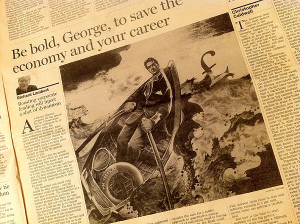
Quick photo of the black and white printed version for the time being - it appeared in colour in the London edition...
-----------------------------------------------------------------
-----------------------------------------------------------------
|
|
FINANCIAL TIMES
The one thing about doing editorial work with a deadline of only a few hours from start to finish is that you work completely on instinct. It means cutting corners, finding quicker ways to get it to a 'finished' state - or at least a state where you're reasonably comfortable with letting it fly the nest.
It's seat of the pants stuff, and as it's your name on it there's nowhere to hide. Anyone looking at the piece doesn't know that you only had three hours from start to finish to pull something together (as was the case with the Red Riding Hood/Big Bad Wolf piece above) - it either works or it doesn't.
Sometimes that means your level of finesse is severely blunted because your concern is more with doing 'something' rather than finessing what you've got, which can be a bit frustrating.
Sometimes it means you end up with something you didn't expect - 'serendipity', as my old art college tutor used to say...
As long as quality doesn't suffer too much, I'm not going to complain too much. Work is work and it's great to be given the opportunity to work for such a great client.
-----------------------------------------------------------------
-----------------------------------------------------------------
|
|
FINANCIAL TIMES ILLUSTRATIONS
A pair of illustrations for the London Financial Times, 21.12.10...
-----------------------------------------------------------------
-----------------------------------------------------------------
|
3x3 Annual No.7
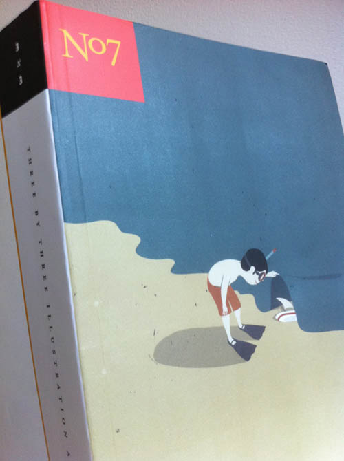
The latest 3x3 Annual (No.7) finally dropped through my letterbox the other day. Very nice it is too. I have a humble effort selected for inclusion which I've attached a photo of. Hopefully I'll get around to snapping a better one at some point.
The annual itself can be bought here....
-----------------------------------------------------------------
-----------------------------------------------------------------
|
OFFSET2010, DUBLIN
If you were one of the 1200 or so punters/delegates who attended the OFFSET2010 event in Dublin you may have seen my work nestled in the online pdf and printed brochure. The IGI flatteringly used my award winning 'Strawboys' image for their ad as one of the event sponsors.
Click the OFFSET logo on the sidebar of this page for more info on this 3-day festival of Design.
-----------------------------------------------------------------
-----------------------------------------------------------------
|
'ILLUSTRATOR OF THE WEEK' - KINGSTON UNIVERSITY, LONDON
While checking the beePencil.com webstats I discovered that I have been singled out as the 'illustrator of the week' on the Kingston University Illustration noticeboard.
Looking at previous IotW's I can see I am in good company. An honour, indeed...
Kingston keeps popping up of late, having recently had a good showing in the 3x3 student show and AOI TfL competition. A fine establishment for sure...
Link here...
-------
While I'm on the subject, I find it quite useful to check through the webstats and do Google searches for myself, not out of narcisissm, but simply because it's useful to see what pieces of work, if any, are being picked up on by 'people in the know' ie. your peers and contemporaries.
Working from home in isolation means you only have your inner critic to keep you right, so it's interesting to get feedback of any kind from well-informed voices that don't originate from inside your own head...
It's the same reason why it's good to enter your work in competitions from time to time - not out of any over-developed sense of competition and determination to win, but just to see what kind of reaction the work gets, if any. A reaction of any kind - win or lose - can be very useful... It's best not to read too much into it though, at the end of the day - your inner critic is the one who gives the best advice (as long as you feed him well and let him out of the coal cellar for a bit of a run around the yard every so often)...
Interestingly, the few pieces of my work that have turned up on other blogs also happen to be some of the pieces that I'm most proud of. It's nice to get some validation that these pieces have 'something' about them that is appealing.
A few screengrabs below...
(Of course, if you want to be able to put food on the table you can't afford to forget that it's not just your peers and contemporaries that you are trying to impress with your work at the end of the day. If you lose sight of the fact that the majority of the people who come into contact with your work haven't spent 4 years at art college there's a danger you may end up producing beautiful work, but being beautifully broke...)
-----------------------------------------------------------------
-----------------------------------------------------------------
|
BBC ART COLLECTION EXHIBITION...
Two of my paintings are currently on show in an exhibition in BBC Broadcasting House, Belfast as part of an exhibition of artwork from the BBC collection.
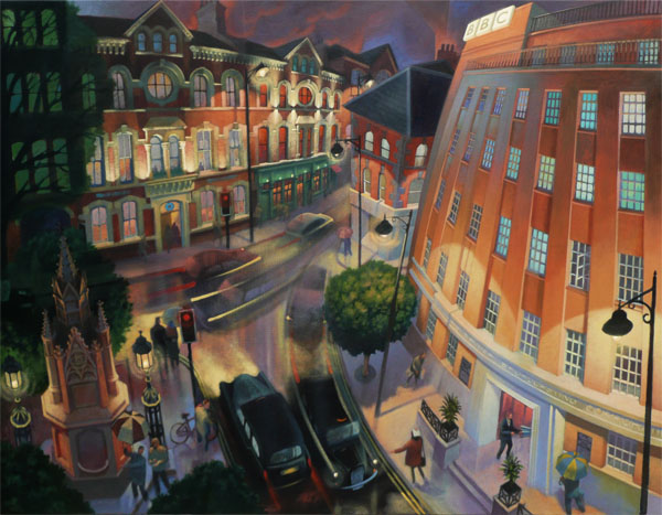
Other works include pieces by Eric Gill, William Conor, T.P. Flanagan, Tom Carr, Maurice Wilks, Rowel Friers, Catherine McWilliams, Rita Duffy, John Bratby and others... including a portrait of 'Goldie' the Blue Peter dog by Rolf Harris and a couple of original animation cells by Bob Godfrey...!
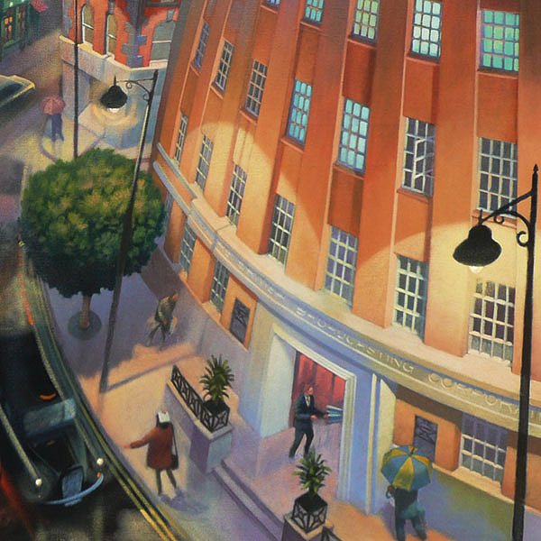
The image shown is my painting of 'Broadcasting House at Night' (2010, Acrylic on canvas 36"x28")
A print of this piece from a limited run of 20 was presented to the outgoing Director General of RTE Cathal Goan at an event in broadcasting house on 27th October.
-----------------------------------------------------------------
-----------------------------------------------------------------
|
'LAUNDRY' EXHIBITION - OFFSET, DUBLIN
I did a piece for a one-off, one-night-only group exhibition as part of the OFFSET design conference in South Studios, Dublin on 29th September 2010.
Artists were asked to do a piece on the theme of airing dirty laundry in public. I had a bit of fun with it...
Exhibition curated by Steve Doogan.
Quick walkthrough video by Steve here...
-----------------------------------------------------------------
-----------------------------------------------------------------
|
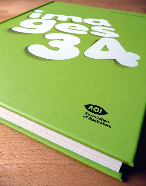
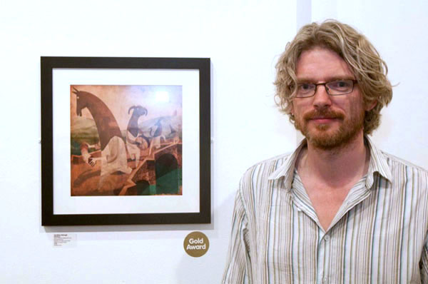
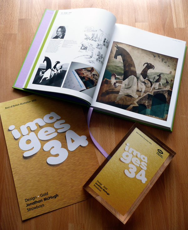
GOLD AWARD - AOI IMAGES 34...!
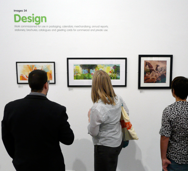
My 'Strawboys' artwork for the AIB calendar picked up a Gold award in the Design category at the Association of Illustrators 'Images 34' exhibition in London.
Gobsmacked.
Now in its 34th year, Images is the longest running and most prestigious jury-selected annual and exhibition in the UK.
It provides the leading showcase for the best of British contemporary illustration commissioned in the UK today, with published work alongside self-initiated promotional artwork and up-and-coming new talent.
The exhibition tours the UK throughout the remainder of 2010 until October 2011:
Beverly Art Gallery, Yorkshire Oct 18th 2010 Nov 28th 2010
Nottingham Trent University Nov 29th 2010 Jan 6th 2011
Blackpool and Fylde College Jan 24th 2011 Mar 6th 2011
TBC March 28th 2011 June 19th 2011
TBC June 27th 2011 July 31st 2011
Clitheroe Castle Museum August 8th 2011 October 9th 2011
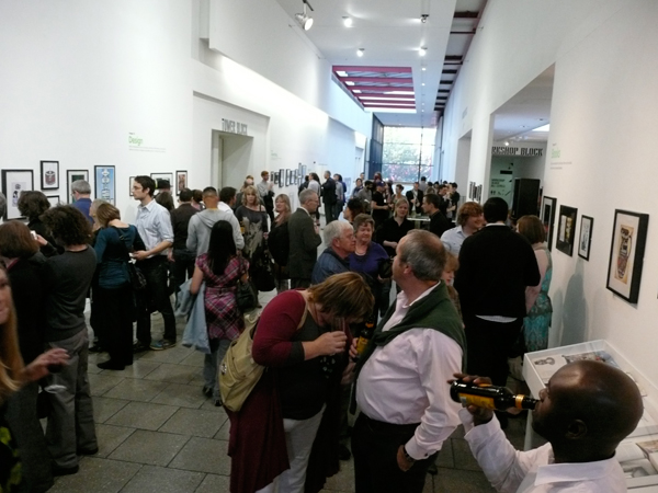
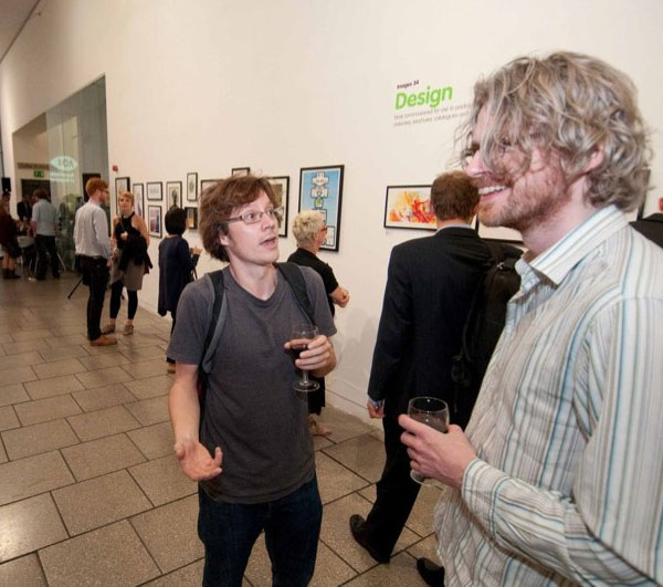
Chris Haughton and Self, pre-awards...
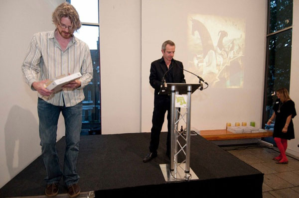
Receiving Gold award from the editor of The Observer, John Mulholland...
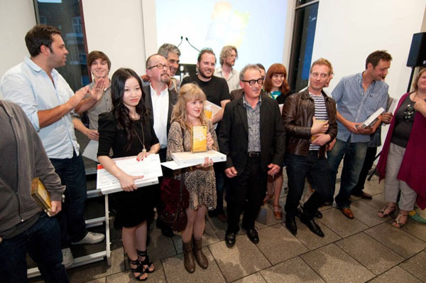
The winners...
Some pics from the night here...
-----------------------------------------------------------------
-----------------------------------------------------------------
|
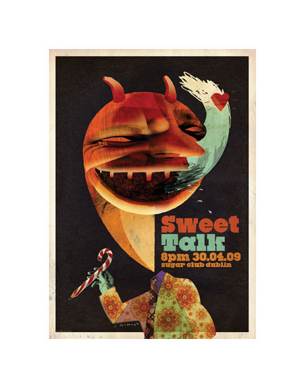
3x3 ProShow, New York...
Very pleased to hear that the piece I entered for the prestigious 3x3 International ProShow in New York was chosen for inclusion.
This is the 7th International 3×3 Magazine Pro Show. With over 4000 entries from across the globe just 200 are selected by a fearsome panel of highly respected judges from across the industry to appear in their Annual, released in Autumn 2010.
My SweetTalk poster did me proud again...
-----------------------------------------------------------------
-----------------------------------------------------------------
|
Selection for Images34...

I'm chuffed to hear that the 2 images I submitted to the prestigious 'Images 34' exhibition were both selected for inclusion.
My 'Strawboys' piece for the AIB calendar, and my poster design for the SweetTalk event I spoke at in Dublin in April were both selected.
From the Images website: "Images is the UK's leading illustration competition, annual, awards show, and touring exhibition dedicated to showcasing the very best contemporary illustration published in the UK.
Images is unique in that it is Britain's only jury-selected illustration competition, judged by a highly regarded panel of industry experts, spanning multiple categories.
The annual celebrates illustration excellence and is distributed to a specially targeted list of international commissioners and sold worldwide."
Book and exhibition launched September 2010.
-----------------------------------------------------------------
-----------------------------------------------------------------
|
IGI Exhibition at OFFSET 2009, Dublin...
The Irish Guild of Illustrators are proud to announce the opening of a new group exhibition.
The show will contain unique prints of work from the last 12 months by 30 members of the IGI. The show will run in conjunction with OFFSET 2009 from Wednesday 4th Wednesday 11th November in Solas bar on Camden Street.
My piece 'Strawboys' from the AIB calendar is my effort in the exhibition.
-----------------------------------------------------------------
-----------------------------------------------------------------
|
Absolut exhibition moves to Twisted Pepper...
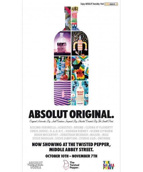
The AbsolutOriginal exhibition from the 2009 Dublin Fringe festival has been moved lock, stock and ice bucket to the Twisted Pepper, Middle Abbey Street, Dublin.
That's my effort in the above poster - the colourful one, middle left...
-----------------------------------------------------------------
-----------------------------------------------------------------
|
AbsolutOriginal exhibition, Dublin...
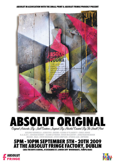
Absolut Original is a new show running during the Absolut Fringe Festival in Dublin that I was invited to submit a piece of work to.
Original Artworks by Irish Creatives inspired by the Absolut bottle featuring Aisling Farinella, Abestos, BRENB, Clíona OFlaherty, Chris Judge, D.A.D.D.Y, Eoghan Kidney, Glenn Leyburn, Hugh McCarthy, Jonathan McHugh, Maser, M&E, Steve Doogan, Steve Simpson, Studio AAD and Unthink.
Curated by The Small Print.
5PM-10PM September 5th-20th 2009 at the Absolut Fringe Factory, Dublin (AKA The Boys Scholl, 8 Exchange St. Lower (off Woodquay), Temple Bar)
See more at www.absolutart.ie
-----------------------------------------------------------------
-----------------------------------------------------------------
|
AbsolutOriginal exhibition, Dublin...
Over the years, many artists have been asked to produce work for the AbsolutArt collection based on the image of the iconic Absolut vodka bottle, including Andy Warhol, Keith Haring, Damien Hirst and Louise Bourgeois - so it was a real honour to be asked to submit a piece of work for this exciting project.
I always approach each commission on it's own merits, and try to respond to the brief as honestly as possible, rather than shoe-horning some lost idea from an old sketchbook into a new project, and this was no different.
In this case my initial response came from associating the word 'Absolut', with 'absolution' - and 'AbsolutOriginal' with 'absolution' and 'original sin'. I wanted to play around with the idea of the perceived purity of the vodka spirit versus the impurity of the human spirit. I thought there was a nice contrast between those two ideas that was worth exploring.
My first approach on this idea was very simple and straightforward (see below).
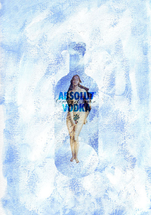
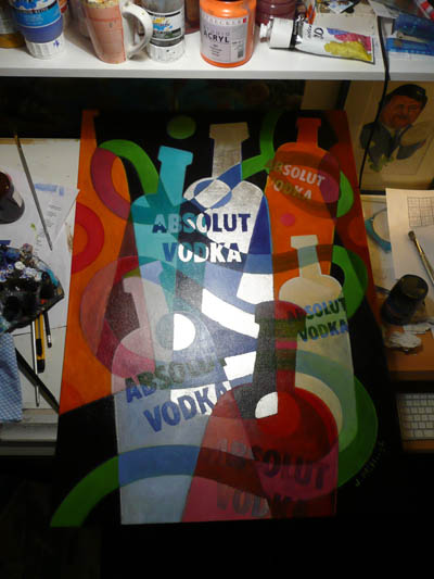
I thought this was a nice idea, and captured something of the pure, crisp, cold, Scandinavian feel of the product. But on this occasion the curator felt that the client was after something more colourful and dynamic, less subtle perhaps and more impactful. I was happy to go away and come up with some new ideas, and bearing in mind the tight deadline, I needed to come up with something do-able within the timescale provided. In the end, the one which got the nod was a simple and colourful composition loosely based on the same theme.
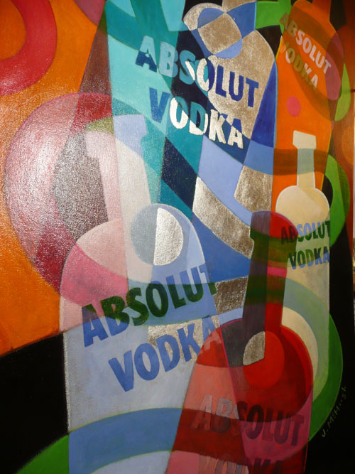
Fragments of the main bottle shape in the centre were picked out by 'gilding' some white gold leaf to the piece (see below).
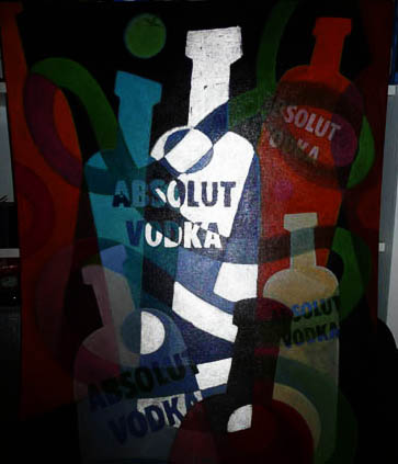
Absolut also does a range of fruit flavoured vodkas, so the colour palette used reflects this. In the end, it couldn't be more different from my original response to the brief...
The final artwork was A1 in size (24"x33")...
Overall, the finished piece fitted in well with the other work on show, and it was a great exhibition in a great venue. Hats off to Absolut, and to exhibition curators BrenB and Richard Seabrooke...
Here is the final piece in situ, as found on some chaps photostream...
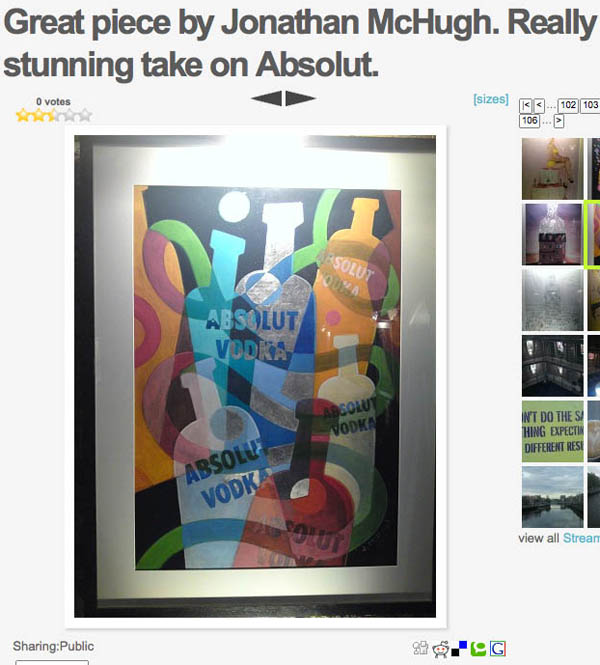
pic: Darragh O'Doyle
-----------------------------------------------------------------
-----------------------------------------------------------------
|
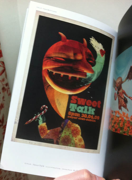
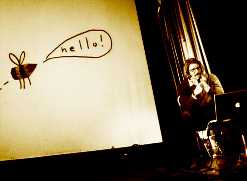
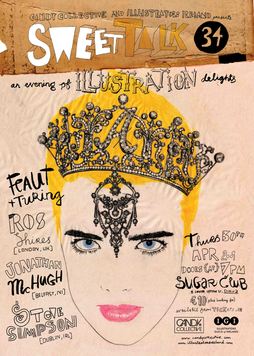
SweetTalk 34...
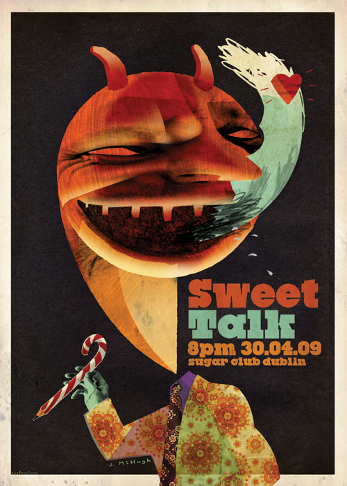
I was asked to chat about my work to 250 paying punters at SweetTalk34 in the Sugar Club, Dublin on 30.04.09.
I went on after illustrators Steve Simpson from Dublin, and Ros Shires from London. Without a plan or a safety net (ie. no script), I managed to give the impression of being articulate of speech for once. I surprised meself, really. Got some nice feedback and encouragement afterwards and thoroughly enjoyed it...
Each artist was also asked to do a piece of artwork specifically for the event which was given out on the night as rather tasty 50x70 posters on a first come-first served basis. My effort is shown above. I had fun doing that too.
Overall, it was a hoot...! Thanks to Aidan Kelly, Candy and the IGI.
Some wobbly pics here...
pic: Justin LaFontaine
-----------------------------------------------------------------
-----------------------------------------------------------------
|
Stereohype button badge thing...
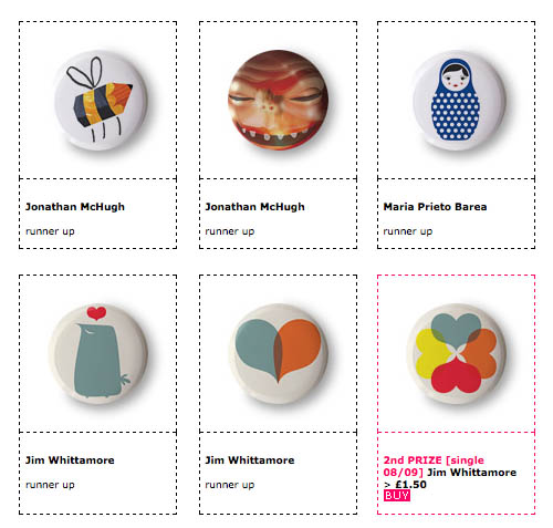
Hey Mr Bee - why are you buzzing around...? ;) More here...
-----------------------------------------------------------------
-----------------------------------------------------------------
|
CandyCollective - SweetTalk Dublin...
CandyCollective & The Illustrators Guild of Ireland proudly present a special Illustration SweetTalk featuring presentations by
Ros Shiers [London, UK], Jonathan McHugh [Belfast, NI] and Steve Simpson [Dublin, IRL]
SweetTalk is the name of CandyCollectives self-initiated series of creative-to creative live events. Its their way of bringing together local creative talent with international luminaries in a relaxed, social environment.
While originally based in Ireland (Dublin, Belfast, Limerick) the series has become popular internationally (London, Newcastle, Copenhagen, Berlin, NYC) and theyre now exporting some of our leading lights to enthuse others as well as focusing attention on homegrown talent.
To date there have been 33 editions of SweetTalk in Ireland (Dublin, Belfast, Limerick, Sligo), the UK (London, Newcastle), Germany (Berlin), Denmark (Copenhagen), USA (NYC) and in the next year the aim is to expand SweetTalk into as many countries as possible.
This one-off event will be held on Thursday, April 30th 2009 at the Sugar Club, 8 Lower Leeson Street, Dublin 2. Doors @ 7pm.
More info on event and speakers can be found on the CandyCollective website. Get your tickets fast as these events sell out quick. Admission is 10 plus booking fee. Tickets are available here.
-----------------------------------------------------------------
-----------------------------------------------------------------
|
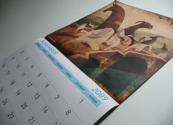
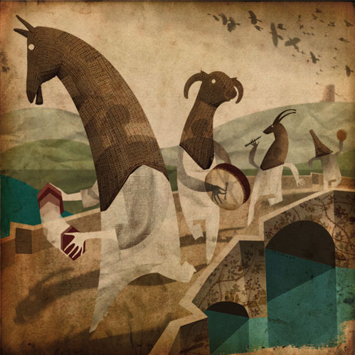
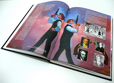
Allied Irish Bank 2009 calendar...
In 2008 I was asked, along with eleven other illustrators, to submit a piece for inclusion in the 2009 AIB calendar (or First Trust in the North of Ireland). Other contributors included Alan Clarke, BrenB, Oliver Jeffers, Stephen Ledwidge, PJ Lynch, David Rooney, Brian Coldrick, Cathy Dineen, Annie West, Adrienne Geoghegan and Olivia Golden.
Each illustrator was tasked to come up with a piece which would shine a light on some lesser known Irish place, somewhere with an interesting titbit of folklore attached to it. My piece depicted Mummers (or Strawboys) in Armagh, my old hometown.
-----------------------------------------------------------------
-----------------------------------------------------------------
|
Artwork for BBC Animation...
 Recently I was commissioned to produce artwork for an animated short by Flickerpix Animation in Holywood.
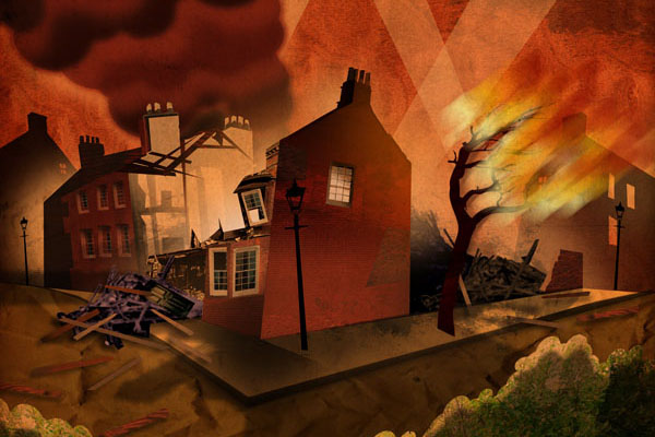
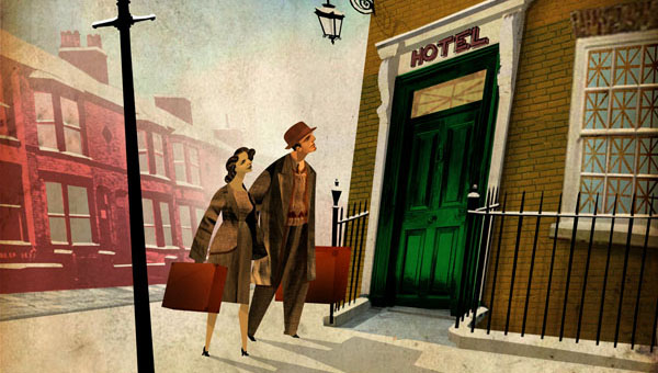
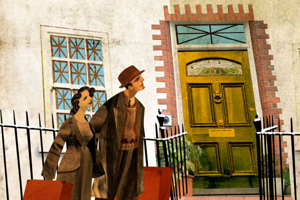
The animation is part of the 'Days Like This' series, to be shown weeknights between 1st and 19th December 2008 on BBC1 Northern Ireland at 10.35pm. The episode I was asked to contribute to is called 'Act of Kindness', and is the final one to be shown before Christmas on December 19th.
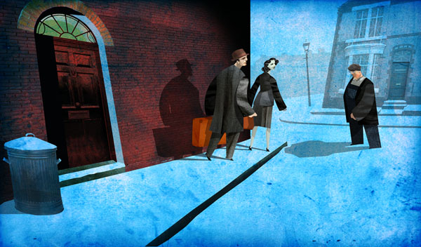
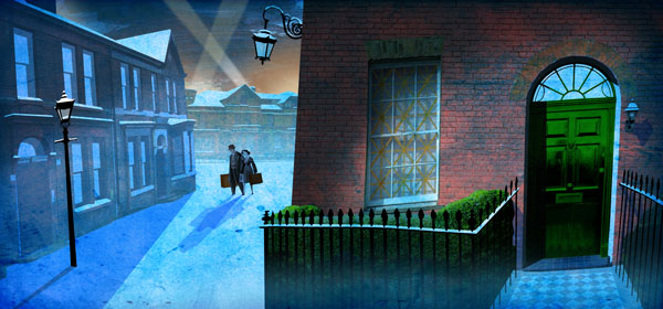
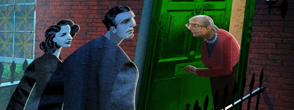
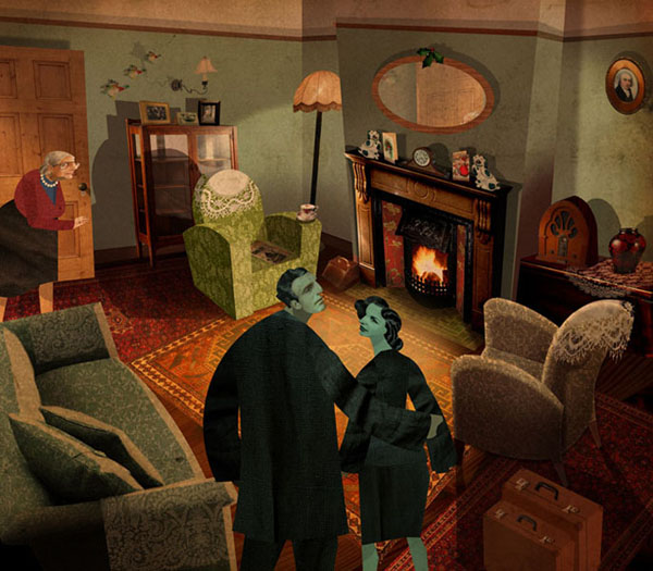
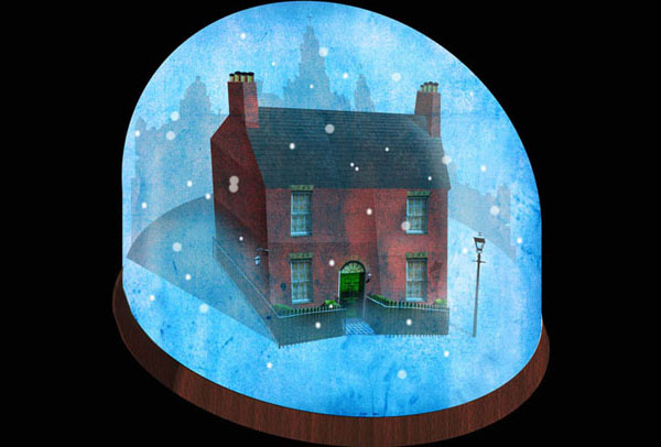
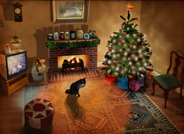
The animations are based on monologues from the BBC Radio Ulster series 'Days Like This', and 'Act of Kindness' is one woman's memory of Christmas 1940, and her experience during the WW2 blitz in Liverpool.
'Act of Kindness' will be broadcast on December 19th, 2008 at 22.45 on BBC1 Northern Ireland.
The 'Days Like This' series won the top gong in the Animation category at the Irish Film and Television Awards, Dublin 2009.
The animation itself can be seen here...
-----------------------------------------------------------------
-----------------------------------------------------------------
|
IGI at the OBG...
September 2008 sees the opening of a group exhibition of IGI (Illustrators Guild of Ireland) members' work at the Ormeau Baths Gallery, Belfast. The title and theme of the exhibition is "Slant: Flattery or Battery?", and contributors were asked to 're-imagine' a famous artwork of their choosing and bring their own particular slant to the piece - flattering or not.
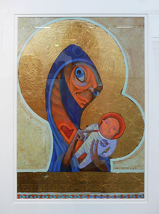
Since the theme appeared to be one of Iconoclasm I chose to tackle 'The Black Madonna', by Unknown. Religious icons are arguably the original mass produced illustrations artworks created for a specific client and for a specific purpose. The client and the purpose are more important than the artist himself, who in the grand scheme of things is incidental and often remains completely anonymous
Illustrator, know your place!
Anyway, the piece sold, and if the purchaser happens to be reading this, please do drop me an email - I'd be interested to know your thoughts on it!
-----------------------------------------------------------------
-----------------------------------------------------------------
|
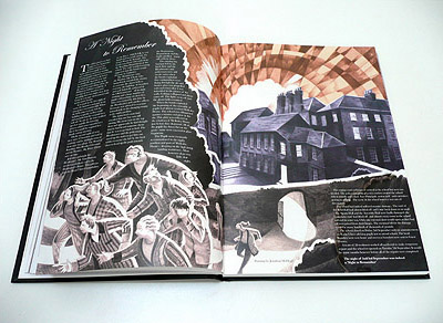
The Royal Schools in Ireland - 400th Anniversary Book...
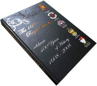 A while ago I was asked to contribute
six illustrations for inclusion in a limited edition hardback
coffee table book to commemorate the 400th anniversary of the founding of the Royal
Schools in Ireland in 1608. The five Royal Schools - in Donegal, Cavan, Armagh,
Tyrone and Fermanagh - all worked together to produce the book to mark
the occasion and to focus on their long histories.
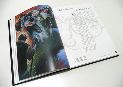 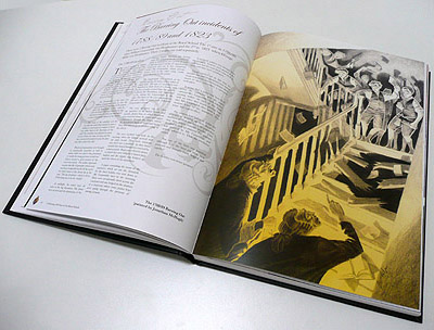
My illustrative contributions were specifically for the Royal School
Armagh section of the book, depicting a few choice moments from
the 400 years of history of the school.
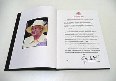
The foreword of the book also featured personal messages of congratulations
to the five schools involved from Queen Elizabeth II and from the
President of Ireland, Mary McAleese.
Historian Jonathan Bardon of Queens University Belfast wrote the
preface which put the foundation of the schools in context with
the history of the region at the beginning of the 17th century.
In tandem with the launch of the book was an exhibition at St Patrick's
Trian in Armagh, which included the original artwork alongside other
material from the publication.
The 400th anniversary celebrations culminated in a personal visit
in March 2008 by Her Majesty The Queen to The Royal School Armagh,
where she was presented with a copy of the book by pupils from the
five schools.
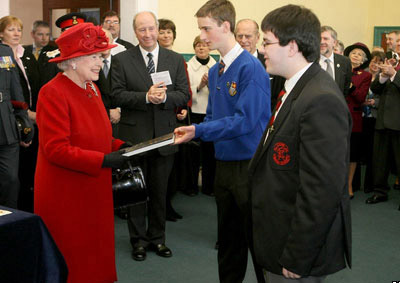
The Queen being presented with a copy of the book by pupils of the Royal Schools.
The Royal Schools were founded in 1608 by King
James I and are amongst the longest surviving non-church organisations
on the island of Ireland.
-----------------------------------------------------------------
-----------------------------------------------------------------
|
BBC Northern Ireland Louis MacNeice Poetry Project...
...here's a bit of a press release from BBC Northern Ireland about a recent project I was involved with...
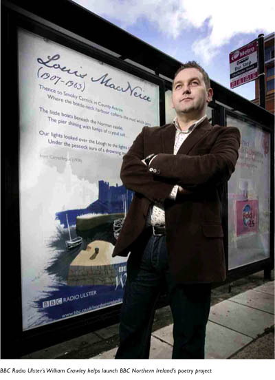 Poetry in motion: BBC Northern Ireland gets on the buses...
BBC Northern Ireland brings poetry to the buses in celebration of
the work of poet and broadcaster Louis MacNeice.
The project
is part of BBC Northern Irelands centenary celebrations of MacNeices
birth and coincides with National Poetry Day. It uses four specially-commissioned
illustrations by local artist Jonathan McHugh to depict some of
MacNeices best known poems.
Selected pieces include an extract
from Carrickfergus - which describes MacNeices childhood home and
his reflections on broadcasting from Autumn Sequel.
The BBCs poetry
posters are being displayed on buses and will also be available
to libraries and schools.
William Crawley, presenter of BBC Radio
Ulsters The Book Programme helped launch the project: It may seem like
an odd place to find Louis MacNeice on a bus shelter or on board
a bus, but poetry is not about classrooms its about bus shelters,
coffee shops, cinemas and busy shopping centres - everywhere you
find people with blood running through their veins.
Further information
about Louis MacNeice and his close association with the BBC and
many local writers is contained within a new touring exhibition
from BBC Northern Irelands Community Archive.
Artworks in original format can be viewed here, here, here, and here...
-----------------------------------------------------------------
-----------------------------------------------------------------
|
Osaka exhibition, Japan...
I was asked to submit six original works for a group exhibition in the Hankyu Department Store in Osaka for a themed 'British Week'. I was one of five artists chosen from the British Isles to participate in this...
Here's some slightly blurry scanned pics and scans of the artwork...
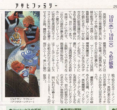
Press...
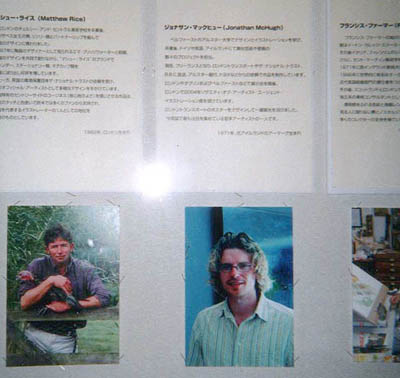
Biographies of participating artists...
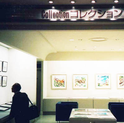
Exhibition space...
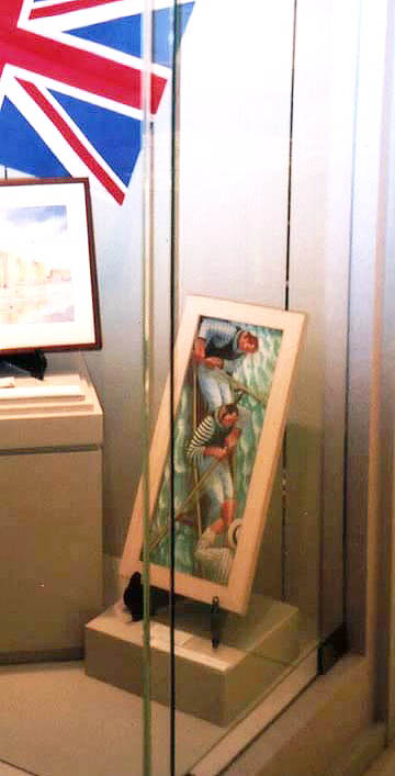
'Boat Race'...
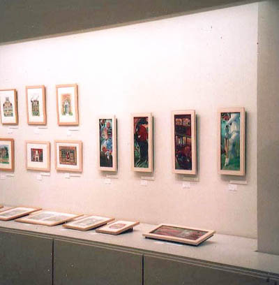
My other five pieces...!
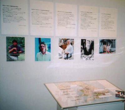
Biographies of exhibiting artists (complete with map of British Isles with pins...!)...
-----------------------------------------------------------------
-----------------------------------------------------------------
|
...the following
is a rather waffly and unedited account of the day I spent with
Quentin Blake in London which was written as a sort
of aide-mémoire for myself to look back upon't. I thought I'd pop
it on the site for a bit of variety and for anyone interested in the man and his work - god knows you'd have to be
to read through all this... Just be thankful I don't have a blog... :)
Q & I.
A day with Quentin Blake.
I studied the scribbled address and glanced up at the numbers on
the houses overlooking the leafy South Kensington square. The scratchy
jagged handwriting and hastily doodled ‘map’ from our
brief meeting at the award ceremony the previous night were unmistakably
from the hand of Quentin Blake. The same distinctive scrawled script
that appears so many times in his illustrations is immediately recognizable,
and seeing handwriting so familiar to me from my childhood threw
me for a second.
I climbed the steps of the address on the card and rang the bell.
At the same time as the intercom crackled into life and a well spoken
lady’s voice greeted me, I spotted Quentin Blake shuffling
down the street towards us. We were buzzed in and I found myself
bizarrely holding open the door for Quentin as he approached on one side, whilst also trying to identify myself to his PA Nikki as she came into the hall to greet us. Any awkwardness I felt at this clumsy introduction was quickly dispelled however, as Quentin cheerily breezed up the steps
and Nikki welcomed us all into the small ground-floor flat that is used as Quentin's 'office'. The walls of the rather dark and narrow corridor were lined with
framed posters featuring Quentin’s illustrations, some in
foreign languages, some promoting several of his many books and
book fairs, some promoting exhibitions of his work, but all of them
adorned with the scratchy, spiky drawings that are his trademark.
Quentin Blake is, for people of a certain age, a national institution.
To borrow a phrase from Sam Mullins who introduced Quentin to the assembled
throng in the London Transport Museum the night before, any of us
who have been children will be familiar with his work, so established
is it in schools all over the UK and beyond. In the primary school
that I attended, his books were used until they fell apart at the
binding. Upon being let loose in the library you would always gravitate
naturally to his energetic and mischievous drawings. Not only that,
but in the 1970’s when ‘Jackanory’ was in it’s
heyday on the BBC, his illustrations of ‘Arabel and Mortimer’
were beamed straight into living rooms all over the country, and
directly into millions of impressionable little minds. He surely
must have unwittingly inspired countless contemporary illustrators
to pick up a pencil in the first place.
The largest room in this tiny ground floor flat is where he houses
his ‘archive’. Large, purpose built shelves that stretch
along the full width and height of the wall are filled to bursting
with laced up portfolios, most of which are labelled, again in that
familiar handwriting. This sight alone was a testament to his prodigious
and prolific output during a lifetime of illustrating.
After Nikki brought us some tea and biscuits, (in mugs adorned
with more of Quentin’s illustrations) and we had broken the
ice with some frivolous chat, Quentin got into his daily routine
of checking his emails and sorting out the business of his day ahead
with Nikki, leaving us in the room with all the portfolios. ‘Feel
free to just take whatever you want off the shelf at random and
have a look. Most of them are labelled if there is anything in particular
you want to see’ he said as he left the room. I didn’t
need any more encouragement than that, and pulled one at random
from the wall of portfolios in front of me. The label said Twelve
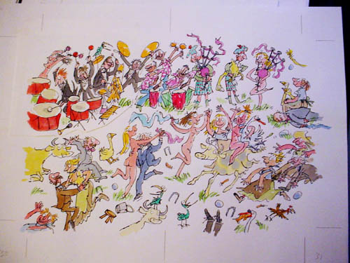
Days of Christmas. In the folio were all the initial rough sketches
for the project, the original artwork and colour proofs from the
publisher; in effect, a whole Quentin Blake book from ideas to finished
product and all the bits in between. In a way I was pleased to see
that his rough sketches were just that. The ‘spontaneity’
that appears in his finished drawings are actually the result of
putting these rough doodles on the lightbox and re-drawing them
on quite heavy Archers watercolour paper using the roughs as a guide.
In effect, 'studied spontaneity'. I was a bit surprised, not to
say heartened by this, as I assumed he just sat down with a sheet
of paper and bottle of ink and the drawings flowed out of his nib
pen and onto the page verbatim. It was interesting to see how the
balance between the looseness of the finished sketch and the craft
of working out the poses and composition beforehand combined and
how the whole thing developed. Most importantly, how he managed
to keep the spontaneity even though he was adhering to a definite
plan and structure.
In this case, the topic of ‘The Twelve Days of Christmas’
lent itself wonderfully to his chaotic illustrative style. The book
progressed from a scrawny and bemused ‘partridge in a pear
tree’ isolated in the centre of the white expanse of the page,
through each successive addition until eventually (by the twelfth
day) the frame was filled to bursting with figures and animals dancing
over the page noisily and interacting with each other. (At this
point I noticed a slightly balding and mischievous male figure depicted
dancing happily with one of the naked ladies and staring out of
the page towards the viewer. (See below.) Portrait of the artist
perhaps…?) (...It's also interesting to note in the picture
below that the group of musicians in the top left of the piece have
been done seperately and 'collaged' in afterwards...)
From there, he took us (us being myself and Deborah) back out into
the street and about two doors down to one of the other flats he
occupies in this grand old London residential Square. When we reached
the top floor (I think I was more exhausted than 72 year old Quentin
by the time we reached the top of the stairs, which says a lot for
the amount of energy he has; and possibly also about the amount of wine
I had the previous evening...) he ushered us into a bright and airy
studio flat with white walls all around and the most basic of furnishings.
This was a real bona fide studio space which had an ‘art college’
feel to it, quite different from the cosy clutter of his home studio
he would be taking us to next. Here, Quentin could indulge himself
and was where he occasionally painted canvases and worked on more
large scale drawings. He showed us a selection of these drawings;
a series of life studies depicting females reading. They looked
quick and spontaneous with a great economy of line, but quite different
to the work we all know and love. The most noticeable thing was
the scale in comparison to the book illustrations we'd just been
looking at. These were certainly not done on a lightbox, and genuinely
were spontaneous and loose. He motioned towards a thick pile of
Archers watercolour paper which he used for these drawings, informing
me that it was the largest size that Archers manufacture. They were
vast. Where do you go after ‘A0’, I wondered, a bit
surprised that the thought had never occurred to me before...
I assumed that by using the largest paper available he was attempting
to stretch his work out of the small scale confines of his book
illustrations, and therefore keep the smaller, tighter work more
fresh. In an adjoining room he had stored a large number of huge
canvases. I began to get the impression that he was quite keen to
show this side of his work, that perhaps he wanted to show that
there was something more to him than simply ‘Quentin Blake
– Children’s Book Illustrator’. The canvases were
in oils, and depicted quite abstract and expressionistic female
nudes in muted grey and brown tones. Judging by the style, I guessed
that some of them were quite old, perhaps a bit ‘1950s Art
School’ in feel, and I had a vague feeling that it was a side
of his work that he would like to get more appreciation for. A less
public and more personal side to his art. Perhaps even Quentin Blake
feels that he still has something to prove.
To the rear of this flat, down a short flight of stairs was another
Aladdins cave. He was there to pick up some Illustrations on board
that had been commissioned and used on the BBC children’s
television show ‘Jackanory’ for inclusion in an exhibition
at Chris
Beetles' Gallery in Ryder Street that he had starting at the
end of the week, and where he would be taking us later in the day.
Again, on many shelves were multiple copies of his books, many translated
into numerous different languages. I saw a tantalizing dusty and
forgotten cardboard box with a post-it note stuck to it that read
‘Award – Bologna Book Fair’... I wanted to ask
him about that, but the conversation moved on and it slipped my
mind.
I was genuinely interested to know what artists influenced him in
his work, and his eyes lit up when I asked him. ‘Ronald Searle’,
he said immediately. Which makes a lot of sense when you see their
work side by side. Like any artist starting out, you could imagine
the young Quentin Blake studying Searle's work and attempting to
copy it, and by doing so his own unique style emerged. He got down
off the ladder he had climbed up to reach some Jackanory pieces
on a high shelf and warmed to the topic, his eyes twinkling. I mentioned
Gerard Hoffnung to see if perhaps he too was an influence on the
formative Blake and he became quite animated, doing manic impressions
of him in a squawky voice, as the sound of building work from outside
filled the room.
Carrying his Jackanory artwork for him, we moved onto his main abode;
a 19th century mansion flat in the same street yet again, just a
few more doors along. This one was much different, much more grand,
the hallway thick with the smell of fresh paint (from the decorators
this time).
Having climbed the wide staircase as the lift was being repaired,
he ushered us into a large and warmly subdued hall which had a muted,
slightly decadent 'Uncle
Monty-esque' kind of feel about it. It’s walls
were lined with old 19th century
Daumier prints, and from there we were lead on through to his
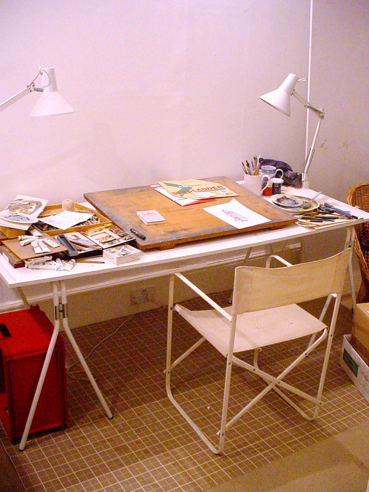
main working area. This was a huge room, with an elegant fireplace
hidden behind the enormous desks, work surfaces, and his trusty
lightbox. Hundreds of books were crammed onto shelves in an arched
alcove.
At the far end was a well worn classic Charles Eames reclining
 leather
chair in front of a set of double French doors that lead onto an
intricate iron lacework balcony overlooking the Square. By the fantastic
light that spilled through these large doors and windows was his
main drawing desk; a vast plain with a forest of quills, brushes,
nib-pens, Japanese brush pens and bamboo shoots whittled into a
nib. In the centre was a shallow white box containing ordered blocks
of watercolour, all the colours carefully labelled in that familiar
Quentin Blake handwritten script. For such a large desk, the actual
space available to work on was severely compromised by having all
of these tools close to hand. I thought of the contrast with the
large scale drawings he'd just shown us in the previous flat. To
the left of all this, sat the lightbox. The general theme of chaotic
but fascinating clutter that you might expect in the studio of a
busy working artist was continued throughout the whole room. All
around on scraps of paper were doodles and inky experiments carried
out with various sized nibs and brushes. Even at this stage of his
career, it seems QB still has the desire to try new things and experiment
with new working methods. It would be easy to assume that with everything
that he’s achieved he could simply carry on employing the
same winning formula in a mechanical fashion, but I was heartened
to see that he appeared to have a healthy amount of self-doubt that
continued to drive him and his work onwards. It gives succour to
the rest of us scribbly mortals. Before meeting him I was a little
apprehensive that he may have been an intimidating academic (he
studied English at Cambridge and was a Professor at the Royal College
of Art for many years) who doesn’t suffer fools gladly, or
an irascible old man at the end of his career perhaps. Nothing was
further from the truth. On several occasions I forgot that I was
with ‘Quentin Blake OBE – Children’s Laureate’.
The good nature that comes across so vividly in his drawings is
just how he appears in person. leather
chair in front of a set of double French doors that lead onto an
intricate iron lacework balcony overlooking the Square. By the fantastic
light that spilled through these large doors and windows was his
main drawing desk; a vast plain with a forest of quills, brushes,
nib-pens, Japanese brush pens and bamboo shoots whittled into a
nib. In the centre was a shallow white box containing ordered blocks
of watercolour, all the colours carefully labelled in that familiar
Quentin Blake handwritten script. For such a large desk, the actual
space available to work on was severely compromised by having all
of these tools close to hand. I thought of the contrast with the
large scale drawings he'd just shown us in the previous flat. To
the left of all this, sat the lightbox. The general theme of chaotic
but fascinating clutter that you might expect in the studio of a
busy working artist was continued throughout the whole room. All
around on scraps of paper were doodles and inky experiments carried
out with various sized nibs and brushes. Even at this stage of his
career, it seems QB still has the desire to try new things and experiment
with new working methods. It would be easy to assume that with everything
that he’s achieved he could simply carry on employing the
same winning formula in a mechanical fashion, but I was heartened
to see that he appeared to have a healthy amount of self-doubt that
continued to drive him and his work onwards. It gives succour to
the rest of us scribbly mortals. Before meeting him I was a little
apprehensive that he may have been an intimidating academic (he
studied English at Cambridge and was a Professor at the Royal College
of Art for many years) who doesn’t suffer fools gladly, or
an irascible old man at the end of his career perhaps. Nothing was
further from the truth. On several occasions I forgot that I was
with ‘Quentin Blake OBE – Children’s Laureate’.
The good nature that comes across so vividly in his drawings is
just how he appears in person.
(Not to mention the fact that his career shows no signs of slowing
down).
He seemed keen to show us the projects he was working on at the
moment, one of which was a series of illustrations for a book by
Michael Rosen about the death of the author’s son called Michael
Rosen's Sad Book. It was a children’s book, and was obviously
a very delicate and brave subject to tackle in such a thing. Quentin
seemed to enjoy the challenge of illustrating a weighty subject
of this nature, and investing it with a lightness that would work
in a book aimed at a young audience. He'd obviously taken great
care and sensitivity in approaching it in such a way that would
be genuinely helpful to a child who may be experiencing a bereavement.
It was a particularly meaty and worthy subject for a children’s
book, and one that he seemed rightly proud of…
(I should mention that at this point he left the room to make a
phone call, and I took the opportunity to shamelessly liberate a
torn and disgarded scrap of watercolour paper from the waste paper
basket by his desk, which had a little scruffy doodle of a small
boy and several splodges where he’d been testing his brush.
Not something I’m particularly proud of, but I doubt it’s
anything he’d miss, and I dare say any other illustrator in
my position would have done the same had they seen a Quentin Blake
original staring up at them from a waste paper basket. It’s
not something that would have any monetary value I’m sure,
and along with the scribbled address and ‘map’ makes
a nice little souvenir for me personally.)
After a light lunch in a local French restaurant nearby, we tagged along
with Quentin as he carried out some of the business of the day,
namely a trip to Chris Beetles gallery in St. James where he was
due to sign copies of his books in preparation for his exhibition
there which was due to open later that week. This turned out to
be a fascinating little place, a gallery devoted to illustrations.
Chris Beetles himself was a colourful character, having the faint
whiff of a Dickensian villain. With his pointy grey sideburns and
business-like manner he appeared to have stepped straight out of
a BBC period drama. Despite this he was very personable, and gave
me an exhibition catalogue as a souvenir, much like the Shopkeeper
in Mr. Benn… There was a sale on, and as Quentin set about
getting writers’ cramp, we headed down to the basement for
a rummage through the piles of unframed ‘sale items’.
These were surprisingly good value I thought, and I was tempted
to part with some of my prize money on a Paul Cox original, but
didn’t fancy having to gingerly carry it around for the rest
of the trip.
As Quentin was winding up his book signing activity, Deborah sidled
up to him with the copy of the ‘Tell Me a Picture’ book
that he’d given us earlier in the day for him to sign. Another
nice souvenir of the day.
By this stage it was nearly 5pm, and the day which was 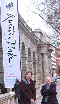 originally
scheduled to last from 10am until 2pm was now on it’s final
stage, namely a visit to Quentin’s retrospective exhibition
at Somerset House. By this stage I could tell that his energy was
beginning to flag a little, and felt that we should perhaps move
on and let him get back to his day. I took the opportunity of asking
him if he wouldn’t mind posing for a photo underneath the
huge banner bearing his scratchy signature outside Somerset House.
Rather awkwardly he agreed, and this is the only picture I have
of Q & I, as I got the feeling early on that he wouldn’t
have been comfortable with me snapping away throughout the day,
and neither would I for that matter.
Inside Somerset house we grabbed a cup of coffee and I quizzed
him about his OBE. He recounted his experience of being invited
to have tea with the Queen. Not many artists or illustrators can
have had this kind of Royal approval of their work. The following
December he was promoted, and made a CBE! (Incidently, if Her Majesty happens to be reading this as she trawls the internet like some kind of regal Googlebot, then might I suggest that she upgrades him to a knighthood as soon as possible...) originally
scheduled to last from 10am until 2pm was now on it’s final
stage, namely a visit to Quentin’s retrospective exhibition
at Somerset House. By this stage I could tell that his energy was
beginning to flag a little, and felt that we should perhaps move
on and let him get back to his day. I took the opportunity of asking
him if he wouldn’t mind posing for a photo underneath the
huge banner bearing his scratchy signature outside Somerset House.
Rather awkwardly he agreed, and this is the only picture I have
of Q & I, as I got the feeling early on that he wouldn’t
have been comfortable with me snapping away throughout the day,
and neither would I for that matter.
Inside Somerset house we grabbed a cup of coffee and I quizzed
him about his OBE. He recounted his experience of being invited
to have tea with the Queen. Not many artists or illustrators can
have had this kind of Royal approval of their work. The following
December he was promoted, and made a CBE! (Incidently, if Her Majesty happens to be reading this as she trawls the internet like some kind of regal Googlebot, then might I suggest that she upgrades him to a knighthood as soon as possible...)
As we entered the exhibition venue Quentin ushered us through reception
with a breezy ‘you don’t mind if I bring my two friends
in with me do you?’ to the lady behind the counter. At this
point he was recognized by two young girls leafing through the Quentin
Blake merchandise for sale in the foyer. One of them nudged her
friend, clearly excited to see the man himself walk in. Quentin
was oblivious to the stir he was causing among his teenage fanbase,
and shuffled on.
Two enormous white cotton wall hangings with a couple of Quentin
Blake illustrations enlarged to a huge scale and printed on them
hung either side of the entrance to the exhibition. ‘I’ve
asked if I can have these when the exhibition is over’, he
said. ’I think they’ll make great curtains…’
Modesty forced him to leave us to look round the exhibition at
our leisure, without him peering over our shoulders. The exhibition
itself was a real revelation, and certainly enhanced my appreciation
of him and his work. The most astonishing bit for me was the video
presentation at the end, which was footage of Quentin talking to
camera and drawing at his lightbox in his mansion flat. The room
housing the video display was darkened, and I think the other viewers
at the exhibition were oblivious that the man himself was standing
at the back with his arms folded, watching the screen along with
everyone else.
With that, one of the Museum curators came along to whisk Quentin
off to finalise plans for his lecture there a couple of weeks later.
It had been a genuine privilege to spend a day with a real life
illustration legend, and we said our goodbyes and mingled back into
the throng of London outside in search of fine wine and food for
our bellys, oh yes…
January 2004
-----------------------------------------------------------------
-----------------------------------------------------------------
|
|
|
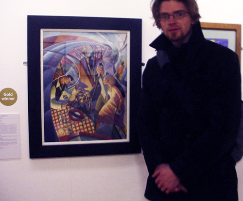
GOLD at Society of Artists' Agents Awards, London...
I was very fortunate to win the top prize at the SAA Awards in London, 2004. The competition was run in conjunction with Transport for London, and the brief was to create an image to be used on a poster to be displayed on the London Underground network with the theme of 'Eating Out by Bus, Tube and River'.
As well as the poster being displayed on the Underground, there was also £3000 in prize money for the Gold winner, and the privilege of spending a day with the legendary Quentin Blake at his studio in London (see write up above...)
I entered this competition because I'd long been looking for an excuse to do a painting of the tube, and also because I wanted to see if my work could hold its own among my contemporaries in London, as up until this point I had worked exclusively in Ireland.
I had hoped to maybe squeak into the 50 or so selected for the exhibition to go along with the award. I was blown away to actually win the thing!
The piece was acrylic on board. No Photoshop!
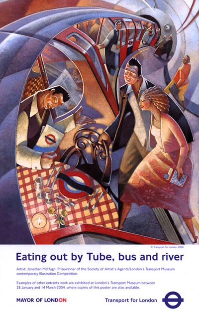
(...excuse the terrible pic...!)
-----------------------------------------------------------------
-----------------------------------------------------------------
|
|